Lead Product Designer
Auto
Loans
Product choice, repayment calculation, and application status—organised around the decisions a borrower needs to make.
The auto loan page design brings product choice, calculation, and application status into one reading flow.
Project overview
The work
behind the work.
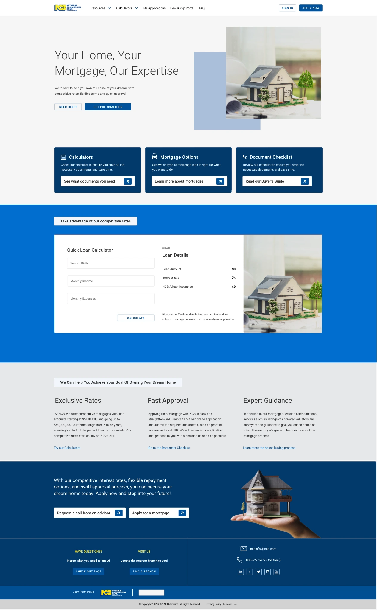
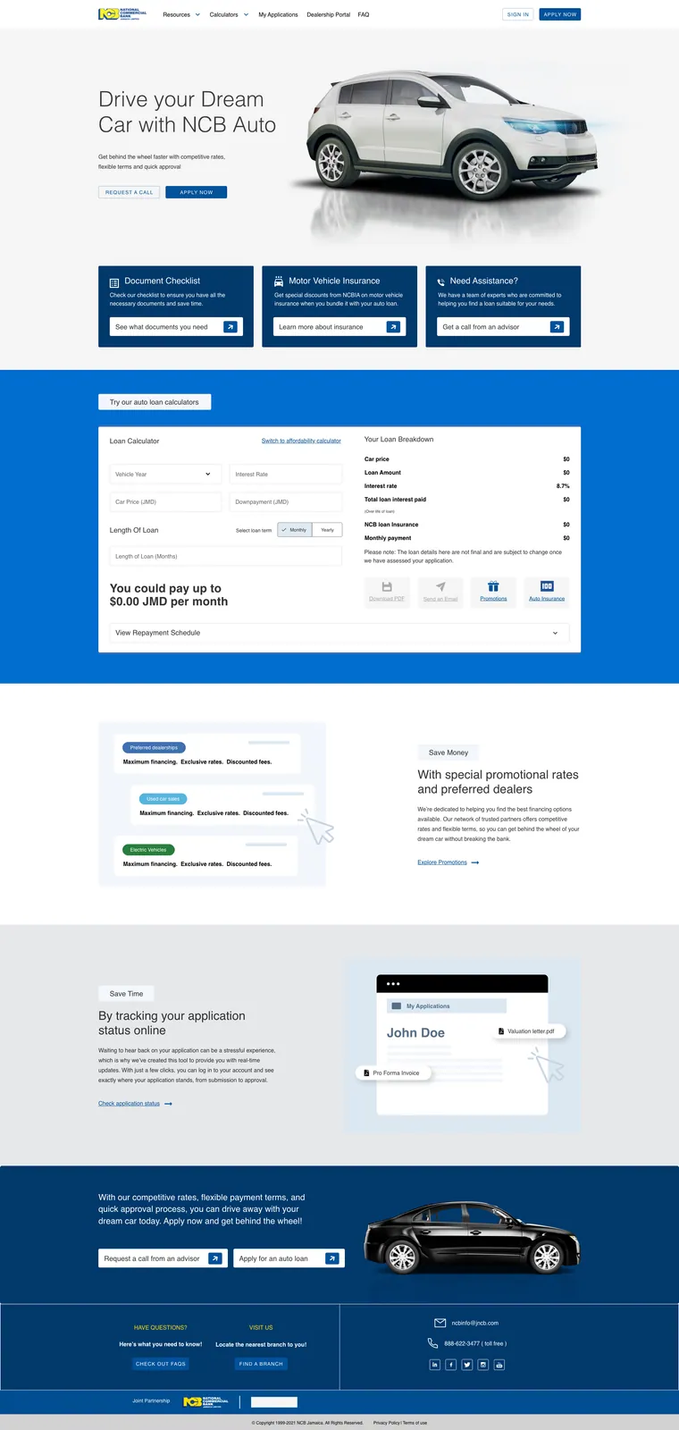
The original desktop design brings the product offer, preparation resources, repayment estimate and application tracking into one page. Each section supports a different question or next action.
I focused on information architecture and action hierarchy: organising the material from the opening offer through preparation, calculation and onward paths.
Decision in focus
Estimate the cost. Return to the application.
Estimating a repayment and checking an existing application are different tasks. The original desktop design gives each a distinct place in the page.
Work out an estimate
Vehicle year, car price, downpayment and loan length sit beside a Loan Breakdown column. The repayment-schedule row sits beneath both columns, keeping its detail within the calculator.
Calculator detail · inputs and breakdown in adjacent columns.
Return to an application
A separate status section pairs a Check application status link with an illustrated My Applications destination. The account card and document labels connect the action to the proposed view.
Application-tracking detail · illustrated My Applications destination.
Make preparation visible
The full artboard places document-checklist, insurance and adviser-help cards before the calculator. Each card names a different preparation question and offers its own action.
Keep estimates qualified
The qualification keeps loan details provisional until the application is assessed. It sits directly beneath the breakdown, with the estimate it qualifies.
Recognise the return-visit cost
Tracking has its own action, but sits after the calculator and promotional content. The page gives first-time discovery more space, while the returning-applicant section sits further down.
My focus was UX, information architecture and action hierarchy. Both details come from one original desktop artboard, presented here as design evidence.
A closer look
Design in detail.
Explore the full layouts and the relationships between their parts. Select an image to inspect it at a larger scale.
Full product design: follow the hierarchy from the opening offer through the calculator and application tracking.
Reflection
The constraint.
The response.
The constraint
The page needed to accommodate both product discovery and return visits: preparing documents, exploring an estimate, starting an application and checking an existing one without treating them as the same task.
My response
Preparation cards lead into a calculator that pairs inputs with a loan breakdown. A separate tracking section gives returning applicants a recognisable destination.