
Drawn to
be held.
I bring illustration, structure and information together in packaging. This work for Pure Chocolate Jamaica follows those decisions from a flat drawing to a family of objects, within the existing brand.
Larnelle Chambers / Pure Chocolate Jamaica
The illustration crosses the folds. Product information has its own panel; the opening reveals another part of the drawing.
I designed the illustrations, packaging forms and graphic layouts within PURE’s existing identity. The work moves between expressive front panels and the quieter details that make a pack usable: names, instructions, ingredients and the way it opens.
- Illustration
- Portraits, birds and botanicals
- Structure
- Cartons, pouches and labels
- Information
- Hierarchy across every panel
A design takes shape in the revisions.
Three stages of one pack. I explored the balance between the product name and the illustration, then brought the front and back into one layout. Open the artwork to see what changed.
First concept
Violet, cacao and a hummingbird establish the character. The product name sits low over the illustration, beneath the large PURE mark.
Re-authored revision
A brown field and serif product name shift the hierarchy. Drinking Chocolate Mix moves to the centre; the illustrated cup brings preparation into the front-panel story.
Current working artwork
Violet and the hummingbird return with a larger product name. The reverse groups preparation, ingredients and batch information. The visible guides remain part of this working flat.
Every surface has a job.
A carton is read from more than one side. These original layouts show how the illustration, copy and folds work together, including the piece that accompanies the pack.
A portrait that carries the flavour.
The plantain crown leads the front. Colour and small illustrations continue around the carton, while the reverse keeps the practical information together.
The same structure, a different voice.
A cream front gives the portrait room. Pepper illustrations and a darker green carry the flavour into the side panels without competing with the name.
Designing what happens after opening.
Instructions, flavour diagrams and space for notes turn the accompanying sheet into something people can use while tasting.
A language that changes shape.
See how the same approach adapts to six packaging formats. Choose a design and open the full image to inspect it. These are design presentations, not photographs of stock.
Twelve current packaging presentation mock-ups, with notes on illustration, layout and form.
01 / 12 · Pantry
Cocoa Tea
A red field and large product name anchor the illustrated front. The reverse separates preparation steps from ingredients, storage, and the batch field.
- Format
- Gusset pouch
- Visual language
- Doctor bird · hibiscus · cacao
Browse all 12 designs

Cocoa Tea
A red field and large product name anchor the illustrated front. The reverse separates preparation steps from ingredients, storage, and the batch field.
Visual signature: Doctor bird · hibiscus · cacao
Three cocoa balls · approximately 90 g
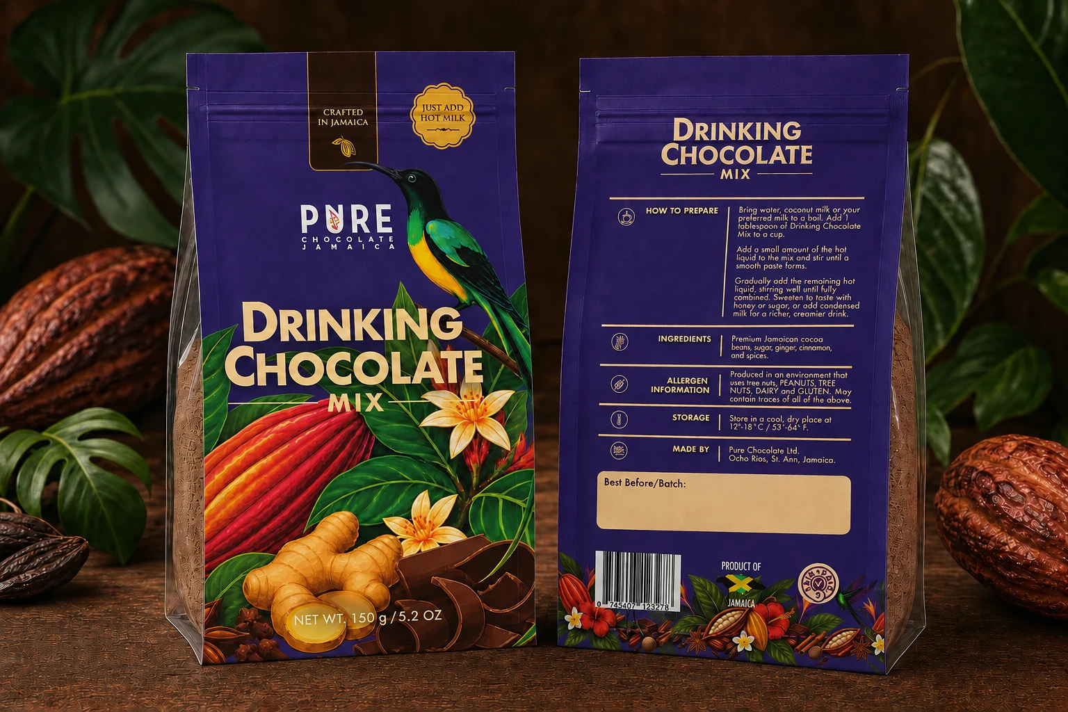
Drinking Chocolate Mix
Violet distinguishes drinking chocolate from the red Cocoa Tea pack. Bird and botanical imagery share the family language while the reverse carries preparation and product information.
Visual signature: Ginger · cacao · violet field
Jamaican cacao · ginger · spices · 150 g / 5.2 oz
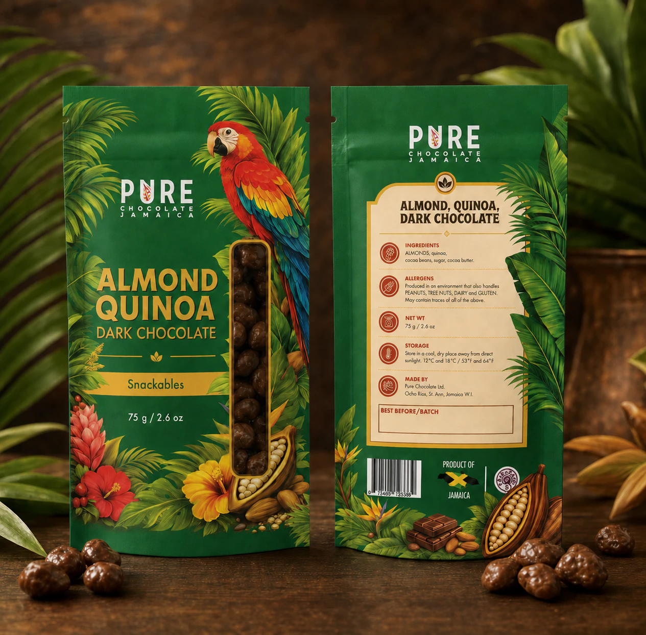
Almond, Quinoa, Dark Chocolate
The vertical window sits beside the stacked flavour name, framed by a macaw and foliage. A cream reverse panel gives the product information its own clear space.
Visual signature: Almond · quinoa · green field
Snackables · 75 g / 2.6 oz
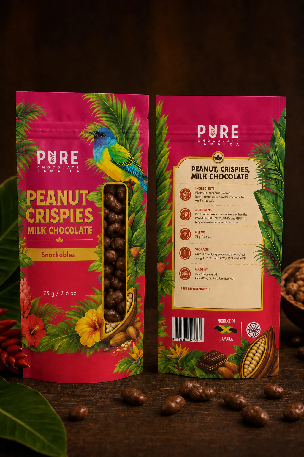
Peanut, Crispies, Milk Chocolate
Magenta and a blue-green bird separate this flavour within the Snackables family. The same window position, flavour hierarchy, and cream reverse panel hold the range together.
Visual signature: Peanut · crispies · magenta field
Snackables · 75 g / 2.6 oz
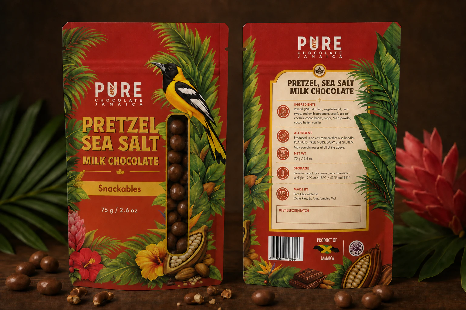
Pretzel, Sea Salt, Milk Chocolate
A red-orange field sets the pretzel flavour apart. The clear product window and illustrated border carry the same layout into another member of the Snackables range.
Visual signature: Pretzel · sea salt · vermilion field
Snackables · 75 g / 2.6 oz
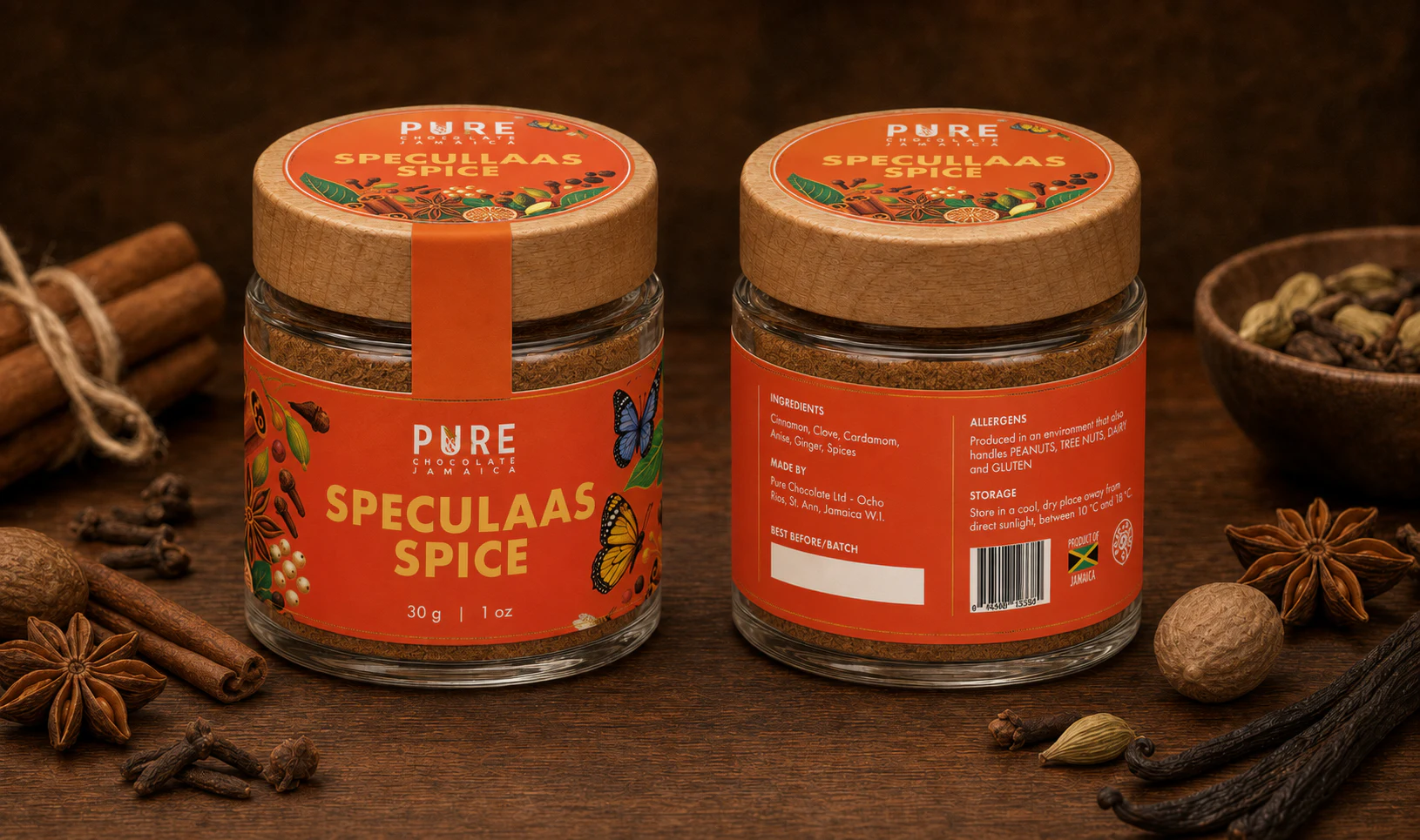
Speculaas Spice
The orange wrap carries spice illustrations around the jar. A matching circular lid label connects to the body with a tamper strip; the reverse keeps practical information grouped.
Visual signature: Spice botanicals · orange wrap
Jamaican spice blend · 30 g / 1 oz
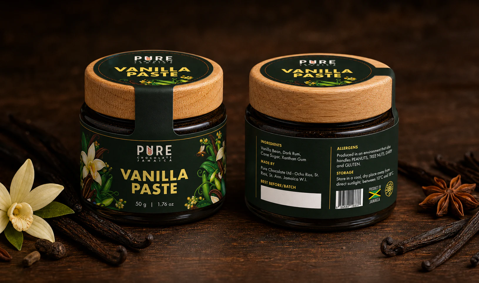
Vanilla Paste
Deep green and vanilla orchids connect the jar to the wider vanilla range. The lid and body labels repeat the same palette, linked by a narrow tamper strip.
Visual signature: Vanilla orchid · deep-green wrap
Jamaican vanilla bean paste · 50 g / 1.76 oz
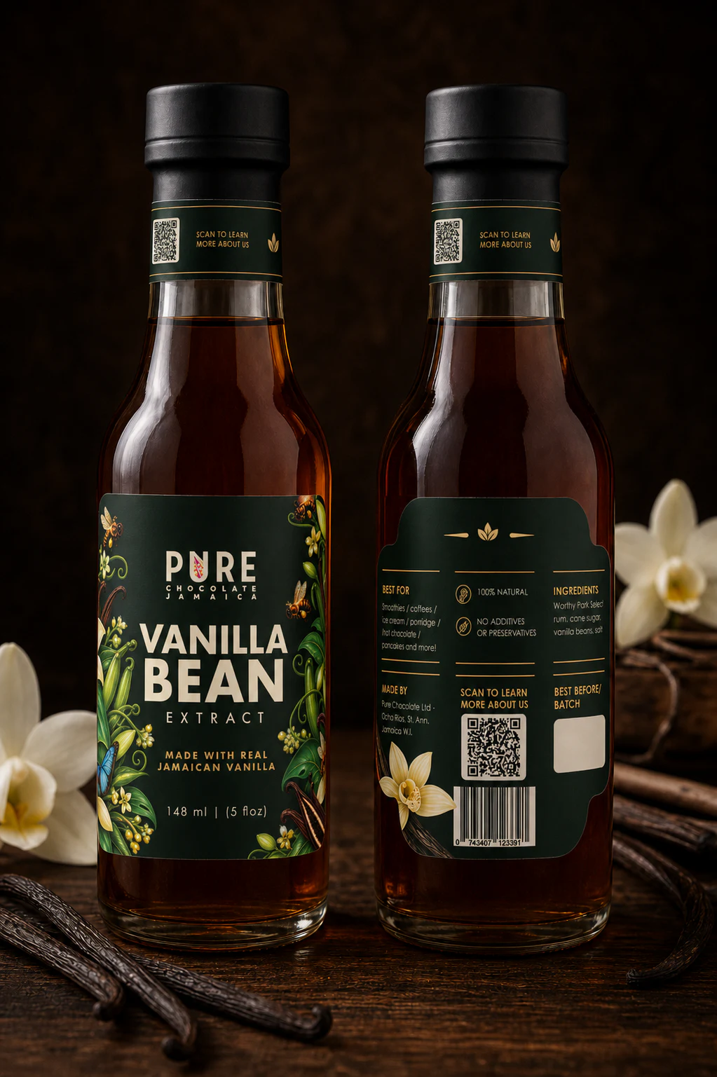
Vanilla Bean Extract
The tall front label frames the product name with vanilla imagery. A separate neck band extends the identity upward, while the reverse divides uses, ingredients, and batch information.
Visual signature: Vanilla botanicals · neck band
Made with real Jamaican vanilla · 148 ml / 5 fl oz
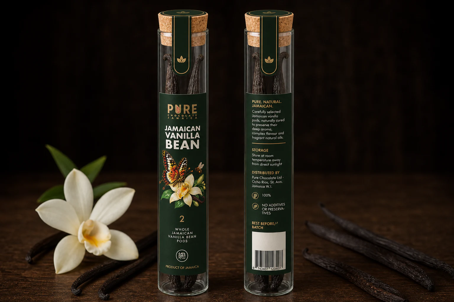
Jamaican Vanilla Bean Pods
A narrow vertical label adapts the vanilla palette to a glass tube, leaving the pods visible. The cork seal repeats the green-and-gold treatment without covering the whole container.
Visual signature: Whole pods · tamper seal
Two whole pods · corked glass tube
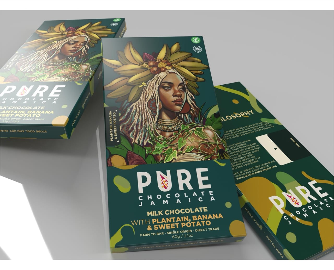
Banana, Plantain & Sweet Potato
A plantain-crowned figure gives the carton its focal point. Teal carries the illustration around the pack while front and reverse panels divide the product story and practical information.
Visual signature: Plantain crown · teal field
Box mock-up — the flagship bar
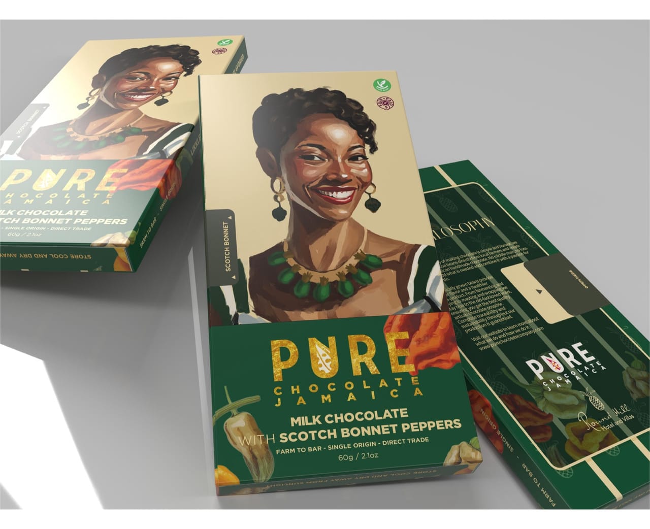
Scotch Bonnet
The painted portrait leads above the deep-green product panel. Pepper imagery links the flavour to the illustration, while the reverse gives the Round Hill story a separate surface.
Visual signature: Scotch bonnet · deep-green field
Box mock-up · green
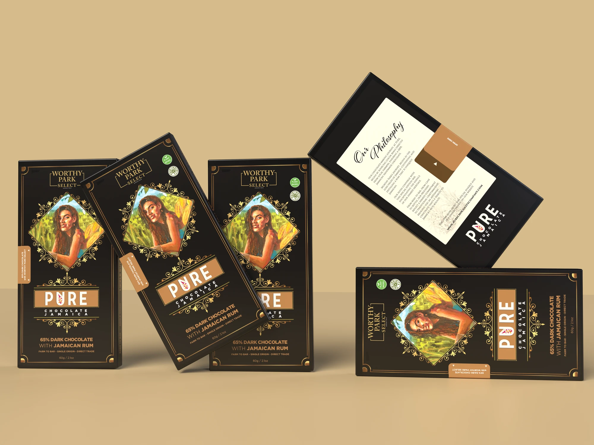
Worthy Park Rum
The portrait sits inside an ornamental gold frame. Black gives the Worthy Park Select name and rum label a clear setting, while the cream reverse panel carries the product story.
Visual signature: Painted portrait · black and gold
Black-and-gold design presentation · 65% dark