
Design reviews, components & governance
Mobile
Banking
Ideas through design reviews, design system components and design governance.
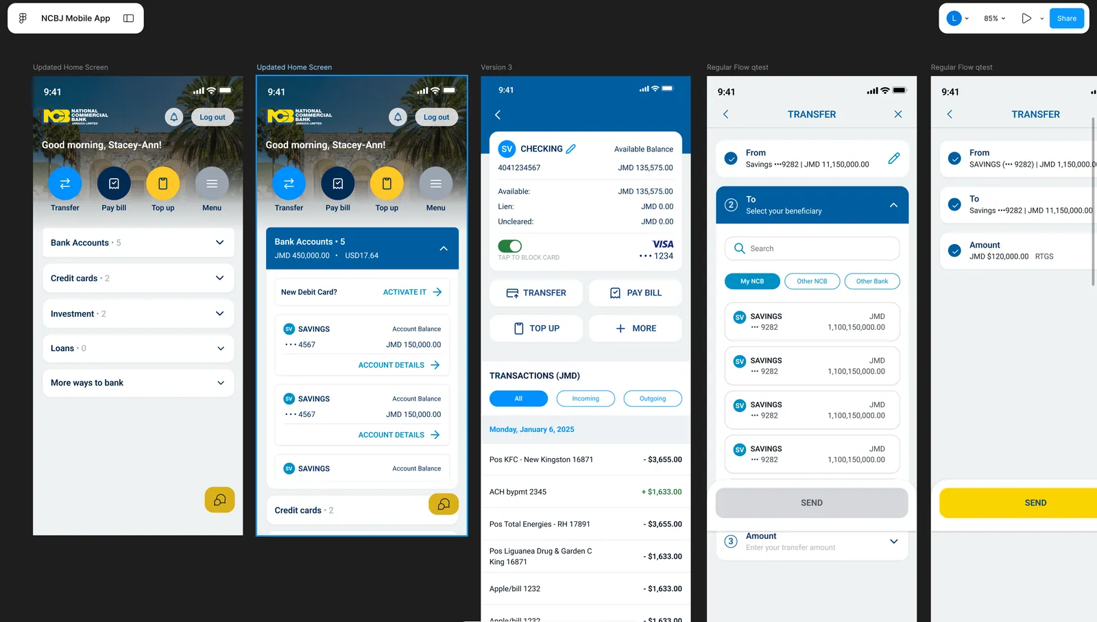
Project design frames: context for my design-review ideas, system components and design governance contributions.
Project overview
The work
behind the work.
My contribution combined ideas shared in design reviews, design system components and design governance.
The project frames give that contribution context: expandable account groups, account details, and transfers share recurring structures while each task has its own information needs. The details below examine those patterns at screen scale.
Decision in focus
One home. Two information densities.
The same home screen can offer a compact account overview or expose balances and account actions. Compare what stays fixed with what expands.
Collapsed: the account landscape
Account groups, counts and disclosure arrows fit in a short list. Transfer, Pay bill and Top up sit above the groups, separate from any one account.
Collapsed home state · detail from the original five-frame design board.
Expanded: the account within it
The Bank Accounts group exposes a balance summary, debit-card activation and individual account cards. The Credit cards group now sits near the bottom of the screen.
Expanded home state · the source board’s selection outline is retained.
Keep a stable action area
The identity, greeting and everyday actions hold their position in both frames. The changing account content sits beneath that shared structure.
Give repeated detail a shared shape
The expanded savings cards repeat account identity, balance and an Account details action. This is the visible component pattern, rather than a different layout for each account.
Recognise the height cost
More account detail means fewer account groups fit at once. The pair makes that density tradeoff visible; the expanded view is not universally better.
My contribution combined ideas shared in design reviews, design system components and design governance. These are two states on one design board, not a before-and-after release comparison.
A closer look
Design in detail.
Explore the full layouts and the relationships between their parts. Select an image to inspect it at a larger scale.
Read left to right: home collapsed, home expanded, account detail, beneficiary selection, and a completed transfer form. These are design frames, not a claim that every state shipped unchanged.
Reflection
The constraint.
The response.
The constraint
A mobile banking system needs recurring patterns without flattening the differences between tasks. Account discovery, transaction history, and transfers each need a recognisable structure and a clear next action.
My response
I contributed ideas through design reviews, worked on design system components, and contributed to design governance. The project board makes the recurring account, action, and transfer patterns available to examine in context.