
Nine weights / Three styles / 27 styles
Precision
Geometric.
A geometric family with a character of its own.
Formerly Oasis, Precision Geometric is my ongoing study of proportion, spacing and the shape of a curve. Nine weights, three styles and 476 glyphs per style.
Purchase enquiries are handled by email. Tell me about your project and the styles you need.Six forms9.6 s each
Live specimen
Make it say something.
Nine weights, three styles, your words. Compare the real upright, italic and condensed drawings — from Thin to Heavy.
Precision Geometric / Regular Upright / 24 characters
Selected setting: 72px / Tracking -0.02em / Upright
Clarity has a character.
A family of voices
- Form follows feeling.Thin · 100
- Form follows feeling.ExtraLight · 200
- Form follows feeling.Light · 300
- Form follows feeling.Regular · 400
- Form follows feeling.Medium · 500
- Form follows feeling.SemiBold · 600
- Form follows feeling.Bold · 700
- Form follows feeling.ExtraBold · 800
- Form follows feeling.Heavy · 900
Explore selected characters
Look closer
The space inside the letter.
Pair spacing
Letters are read together.
Compare the font’s built-in pair spacing with kerning disabled. Size, weight, and tracking stay fixed; only the spacing adjustment between particular letter pairs changes.
Printed pair setting: kerning on.Kerning adjusts individual pairs. Tracking adds space across a whole passage. Use the live tester above to explore the second independently.
The family in use
From a reading voice to an identity.
Give an idea
some room.
A quiet kind of clarity.
A headline invites. A paragraph explains. A caption points to the detail. One family can do all three when scale, weight, measure, and space each have a clear job.
01Gallery
02Studio
03Library
Medium 500 / Regular 400The next chapter
A voice for your next idea.
Purchase enquiries are handled by email. Tell me about your project and the styles you need.
Inside Precision Geometric
From contour
to character.
Follow six letters from outline to finished form. Pause, choose a letter or move the playhead to look at the drawing in your own time.
Precision Geometric / Regular
The drawing.
The space around it.
- Style
- Regular
- Advance
- 1379 units
- Em square
- 2048 units
Compare Regular, Bold and Italic. The baseline and bounds reveal how the drawing changes while its character stays recognisable.
Try the whole familySix forms9.6 s each
Selected motion / Personal study
A letter.
A language.
Tension, assembly, release. An authored study of Precision Geometric.
12 seconds / Silent
Try the living specimen ↑
On the workbench
Tools for the way
I want to make type.
Designing a family keeps raising better questions about the tools. These are two of my answers: a native editor in development and a browser workbench you can use today.
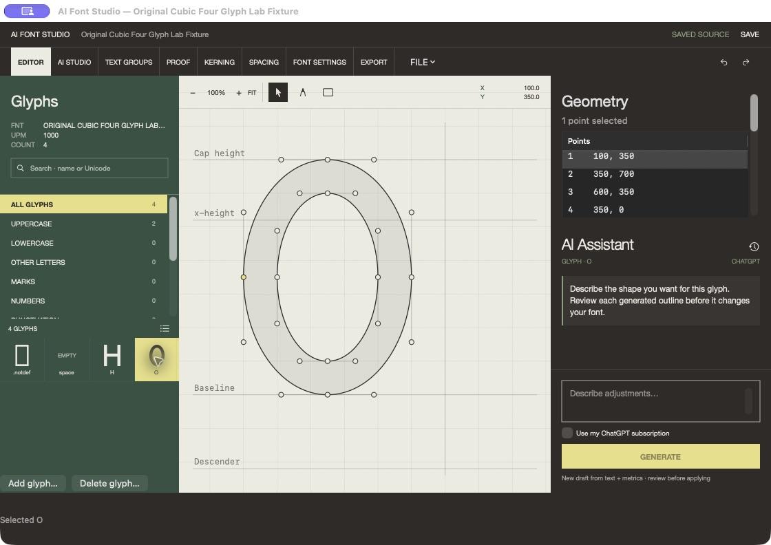
In development · macOS
AI Font Studio
A native editor for drawing and refining letterforms, with reversible edits, saved source history, font export, and AI-assisted glyph drafts.
Working name. The editor is in active development.
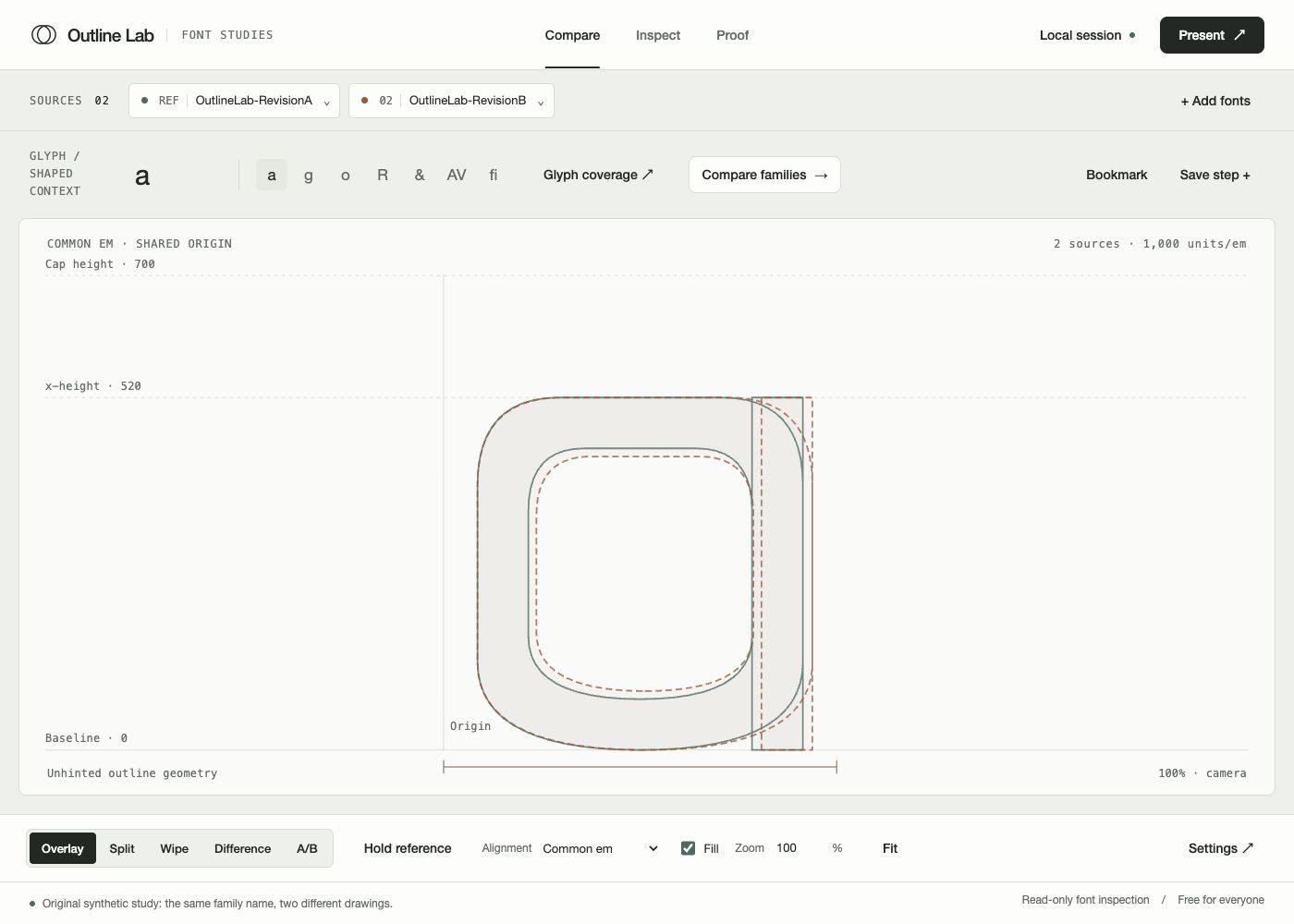
Live · Free · Browser
Outline Lab
A free browser workbench for comparing fonts, inspecting contours and proofing your own text. No account needed.
Open Outline Lab