Website design & design systems
NCBJ
Website.
One bank. Many reasons to visit. I designed the entire NCBJ website, bringing personal banking, business, loans and cards into one connected experience.
Personal banking homepage, captured from jncb.com on 27 September 2026. Website content and photography belong to NCB and their respective rights holders.
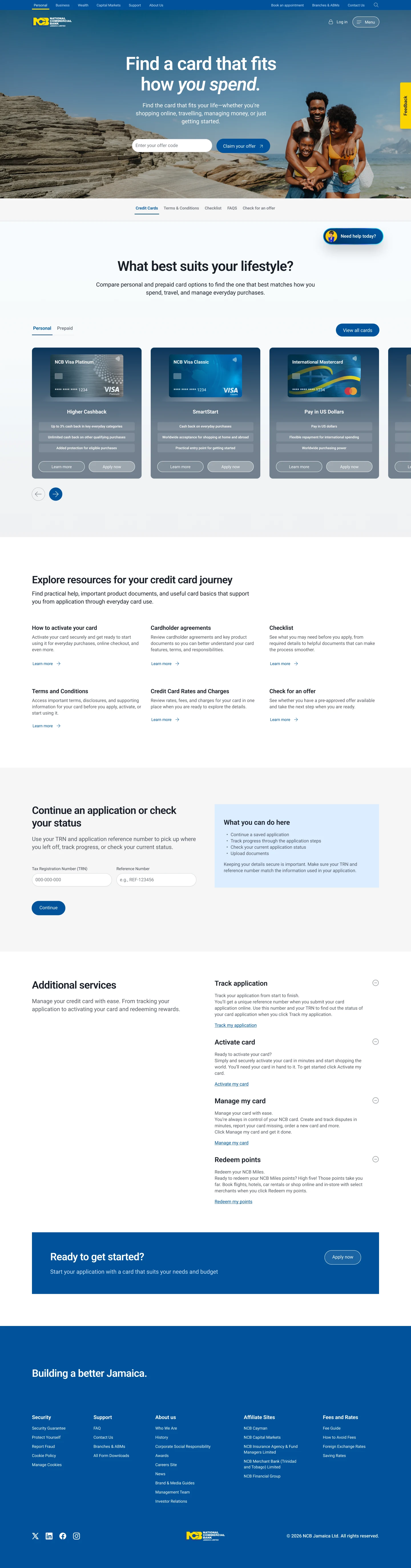
The complete credit-card page from my FY26 Figma design exploration. This is a design-source export, rather than a capture of the launched website.
Project overview
The work
behind the work.
I designed NCBJ’s entire newly launched website: the personal and business experiences, their product pages, and the routes through loans and cards. The work covers how the site is organised, how its pages read and how people move from an initial question to the right next step.
The same bank serves someone opening a first account, a business accepting payments and a customer weighing up a loan. I gave those different needs a shared structure without making every page feel like the same task. Product discovery, useful detail and clear actions connect the experience.
The live pages below show the breadth of the website. The FY26 card designs that follow offer a closer look at the decisions behind one part of it. Earlier lending and mobile work sits in a separate section, with its original scope and contribution intact.
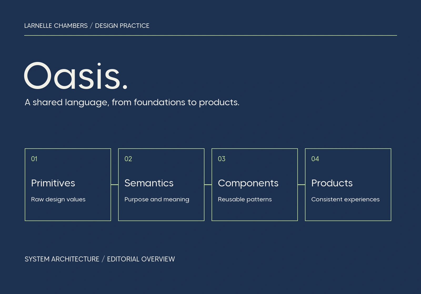
Behind the interface is Oasis, the design system I led: 2,000+ components supported by semantic tokens, documentation and contribution rules. It gave repeated patterns a shared foundation, while leaving room for the task each page needs to support.
The whole website
One experience.
Different needs.
Personal and business banking, loans and cards. I designed the full website, from the way people find a product to the detail that helps them decide.
Personal banking homepage, captured from jncb.com on 27 September 2026. Website content and photography belong to NCB and their respective rights holders.
Personal / NCBJ
Start with what someone came to do.
Accounts, cards, borrowing and everyday banking share an entrance. The homepage gives those routes a clear order, with appointments and online banking close at hand.
Open the live pageLive website, captured 27 September 2026. Content and photography belong to NCB and their respective rights holders.
Decision sequence
Find it. Compare it. Pick up where you left off.
One part of the wider website, in detail. These three decisions come from my FY26 card-page design source; they are shown separately from the live website captures above.
Decision 1 of 3: Make the first step clear.
Product entry and offer-code access · FY26 Figma design
01 / 03 — Find
Make the first step clear.
I paired a direct product introduction with familiar NCB navigation. People can start exploring cards, while someone arriving with an offer code has a specific entry point in the same opening view.
- Recognise the product
- Find the relevant route
- Enter an existing offer
Card comparison · Detail from the full FY26 page design
02 / 03 — Compare
Give different cards a common structure.
The comparison section repeats the same hierarchy for each card: identity, benefits and next steps. That lets the differences carry the decision, with a route to learn more before applying.
- Choose a category
- Compare the benefits
- Learn more or apply
Application return path · Detail from the full FY26 page design
03 / 03 — Return
Make room for the unfinished task.
The experience continues after the first visit. A dedicated application-status section gives returning applicants a visible route back, with the required identifiers and a short explanation beside the form.
- Recognise the return route
- Provide the application details
- Continue the task
Someone comparing cards and someone checking an application share a page, but need different ways through it.
A closer look
Design in detail.
Explore the full layouts and the relationships between their parts. Select an image to inspect it at a larger scale.
The complete credit-card page from my FY26 Figma design exploration. This is a design-source export, rather than a capture of the launched website.
Reflection
The constraint.
The response.
The constraint
A banking website has to serve people at very different points in a decision. Product discovery, comparison and returning to an application all need to be easy to find, without every route competing for attention at once.
My response
I designed a shared navigation and page language across personal and business banking, then adapted the hierarchy to each product. Loans need explanation and calculation; cards need comparison; existing customers need direct routes back. Oasis keeps those pages related while their content and actions do different jobs.
The wider body of work
Beyond the website.
Related lending, mobile and operational work. These projects keep their own histories and responsibilities; the images below are earlier design artifacts or labelled diagrams.
Earlier lending design
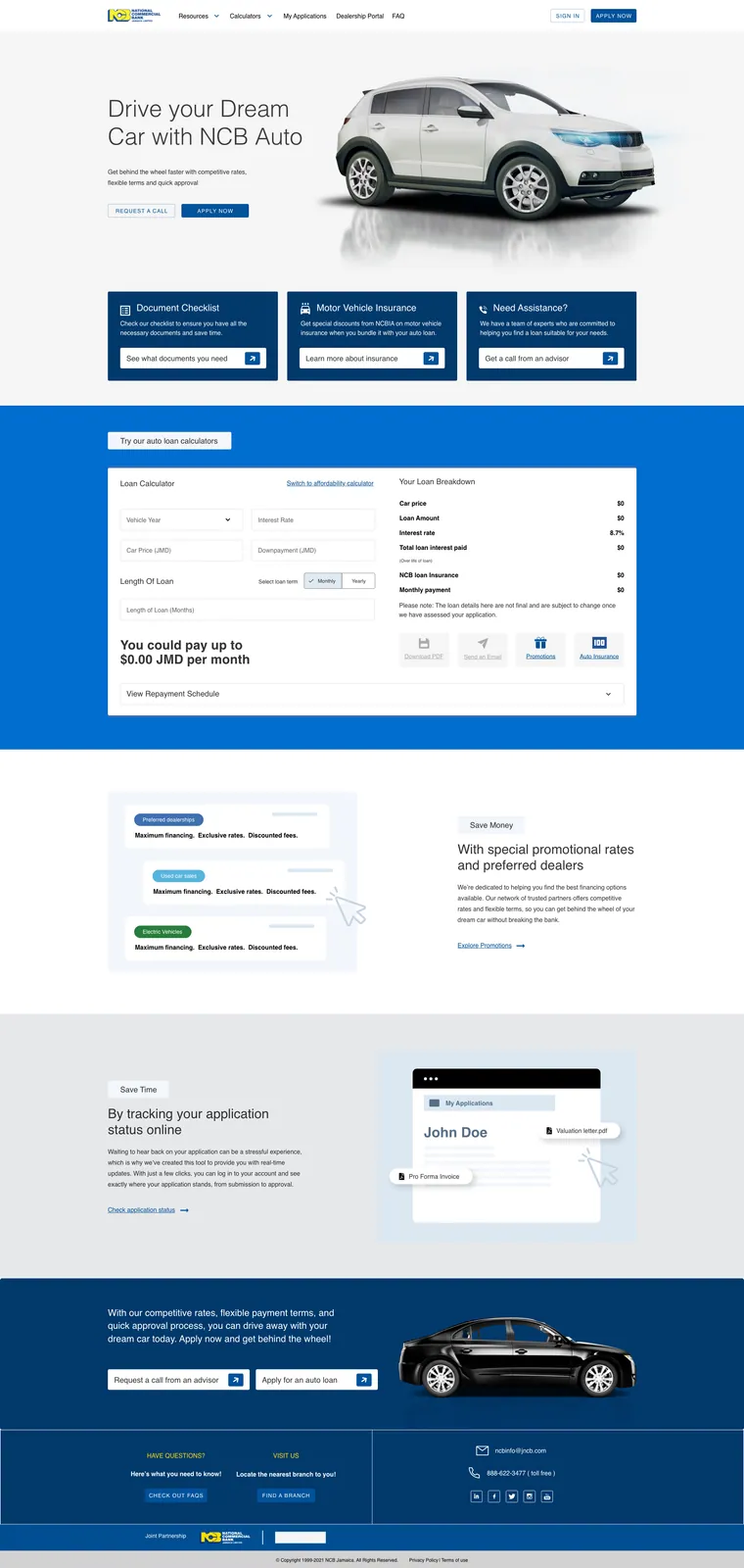
Auto loans
An earlier product-page design connecting vehicle finance, a repayment calculator and application tracking.
2023 design source
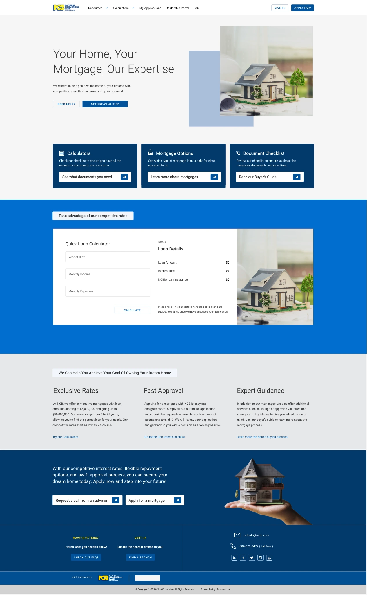
Mortgages
Product discovery, preparation and calculation in the original mortgage design. This is the saved 2023 artboard.
Related product work
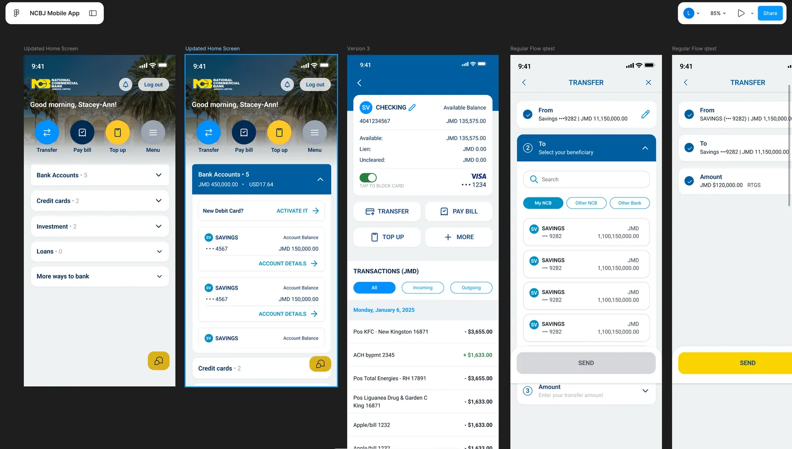
Mobile banking
Design-review ideas, reusable components and governance across the mobile experience. The project board documents that contribution.
Separate operational tools
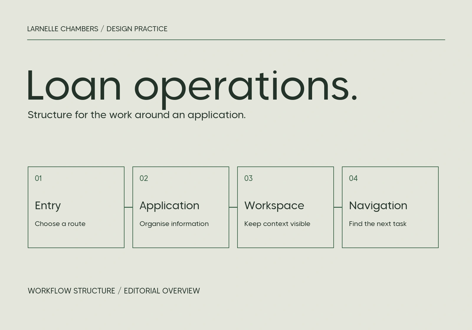
Loan operations
Research and primary design across product-entry and application workspaces. The image is an editorial workflow diagram, not a current interface capture.
Oasis design system
System architecture overview
An editorial diagram of the documented system architecture, not a component-library screenshot.