
Making of / Larnelle Chambers
One practice.
Made to explore.
I wanted the site to feel like the work: precise enough to inspect, open enough to play with.
“Ideas, given form” became the direction for a living specimen. My letterforms, design projects, paintings and fictional worlds share a visual language, while each asks for a different kind of attention.
Inside the decisions ↓
- Project
- Personal portfolio
- Direction
- Ideas, given form — a living specimen
- Visual foundation
- My type, artwork and project sources
- Experience
- Read, inspect, interact
01 / The opening
A letter that
holds its shape.
The homepage begins inside Precision Geometric. A blue g sits between oversized a and R forms drawn from the same font. Touch changes a local part of each letter; the force travels through its structure, carries momentum and settles back into the source outline.
Tension → response → recovery
The motion makes the letter’s construction visible. The headline remains readable and the navigation is usable from the start. Scrolling carries the composition into the work without an intro gate. In Quiet view, the exact source forms still hold the page.
02 / A clear way through
Choose an interest.
Follow it further.
Work, Software, Art and Experiences stay in the main navigation, including on a phone. The Index opens the wider site, including Writing, About and Contact. Fiction and journalism live under L.F. Chambers; the design practice uses Larnelle Chambers. They belong to the same person and the same site.
Work
Digital design, packaging and typography. Choose a discipline, then follow the decisions inside a project.
02Software
Discover, Collect and Create: Who to Follow, Keepstack and StreamLatch, plus Outline Lab, a free browser app, and AI Font Studio, which I’m still developing. Status and source context stay visible.
03Art
Paintings, drawings and illustrations, with a material study of Sunflower Witness and complete originals to inspect.
04Experiences
Deep Survey: planet scanning, a specimen lab and a field guide from the world of The Pale Interval.
Three perspectives on design
The homepage makes a small selection: a banking experience, an editorial system and packaging. The Work page groups the wider collection by discipline. Software keeps its own product stories, and No Safe Rooms sits with the writing.
03 / Presentation & source
Give the work room.
Keep its context.
Each part of the site invites a closer look in a way that suits its material. The source stays available, and the presentation explains what I made, what I contributed and what is still taking shape.
Show the decision and the detail.
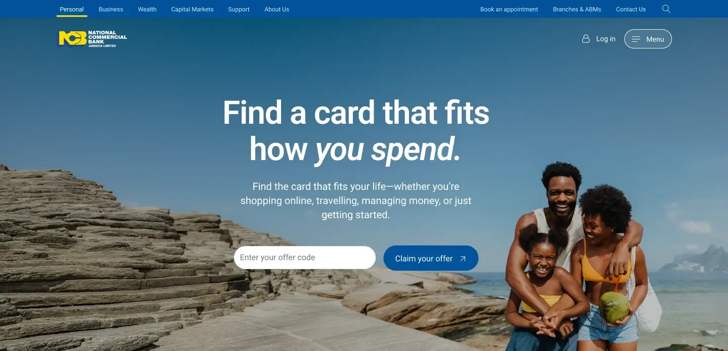
NCBJ covers the full personal and business website, including loans and cards, with Oasis explained as its design-system foundation. The Gleaner describes my editorial and system contribution. Packaging shows working artwork, revisions and structure before the finished range.
Cropped details open the complete source image. Figma designs, live-site captures and presentation diagrams are labelled for what they are.
Inspect the packaging ↗Bring your own words.
Precision Geometric has a construction specimen and a live tester across its 27 styles. Accord Grotesk has a separate tester and four upright weights, available as a free download with editable sources and license notices.
Let the image set the response.
In Sunflower Witness, touch disturbs the surrounding field while the face remains steady. The surface carries and releases that disturbance. It is an interactive presentation of the painting, not a claim about how the painting was made.
The unchanged original remains one action away. The rest of the collection opens as complete images.
Explore Sunflower Witness ↗One visual language
Precision Geometric gives the site its voice, with monospaced labels for orientation. Paper, ink and blue connect the pages, with red used sparingly. Scale, spacing and repeated navigation carry that relationship further, leaving the artwork and project sources their own colours.
04 / Deep Survey
A world to scan.
An object to turn.
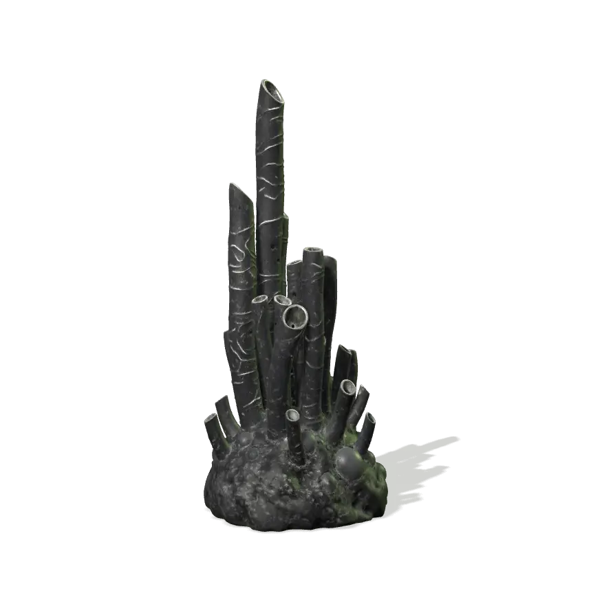
The homepage offers three real 3D specimens to turn and compare, including Harmonic Tubes with its local resonant response. From there, Planet scan and Specimen lab lead directly into two distinct activities.
Planet scan pairs an orbitable world with a stable list of destinations, sites and instruments. A scan is an explicit action. In the lab, turning a specimen and choosing Rest, Wet, Sun or Dark previews its available response; Scan specimen records the corresponding observation. Browsing a reference does not award a recovered discovery.
The field guide brings the worlds, crew, specimens and Meridian together as a readable archive. Its models turn slowly and can be inspected directly. Text and source stills remain available without WebGL, and reading the guide does not change a saved survey. Plot-bearing lab records have a separate reveal choice.
Shared type, paper and navigation make the return journey familiar. The fiction can have its own atmosphere without turning the rest of the portfolio into a fictional interface.
05 / Motion & control
Move with purpose.
Know when to stop.
A visitor-driven surface and an authored film do different work. The glyphs, artwork and 3D objects respond to input. Remotion gives the Living Specimen film a deliberate sequence of tension, assembly and release. These are personal studies, not client commissions.
Living Specimen / Remotion
Tension, assembly and release in a twelve-second film built around Precision Geometric. The sequence is authored; the homepage responds to the visitor in real time.
Open living specimen / remotion clip ↗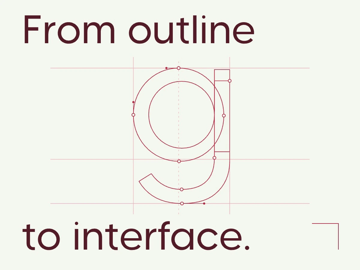
Outline Lab / HyperFrames
A seven-second study of contours and control points. It illustrates the subject of Outline Lab; it is not a recording of the application.
Open outline lab / hyperframes clip ↗Attention is optional
Both films are silent and begin here with a still and a Play button. Across the site, Quiet view and reduced-motion preferences stop automatic movement. Native links, keyboard controls and static sources keep the work accessible. Scenes pause or release their graphics when out of view; the long field guide keeps only a small number of models active at once.